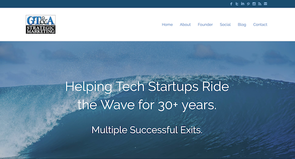
Yes, these are the words I live by. Actually, it was 21 years that I had the same basic web site for my consulting business, before I launched a new site just recently. It’s at my original domain name, gtamarketing.com. (Please tell me what you think of it in the comments below!)
You can see screenshots of the old vs. the new below. Pretty stark comparison, huh? I kid you not: my old site had a footer that read “©Copyright 1995-2016.” It lived a long life! I launched it in early 1995 when I began working with my first Internet client, Creative Internet Solutions (later acquired), a relationship that actually began in late 1994. The first popular browser, Netscape, was just being launched. Oh, I updated the content many, many times over the years, of course — often adding pages here and there, and unlinking others when they became dated or no longer seemed relevant. But the site used the same, basic, plain-HTML structure for all those years. I built every bit of it myself originally and ongoing — and managed the hosting and did all the maintenance and updating all by my lonesome, too. (Yes, I know how to code — haha — but don’t ask me anything beyond HTML!)
For some reason, I never got around to creating a new mobile/responsive site during recent years — even though I knew I should have. It’s the “cobbler’s kids with no shoes” syndrome: I helped many clients create modern new sites during this time, but never had time to do my own! It just wasn’t a high priority — alas, clients must always come first.
The other thing is, I’ve never really relied on my web site to bring me new business. I get virtually all my business by referral, or from previous clients who start a new company or move on to a new employer. The web site was just sort of the obligatory “brochure up there on the web.”
But, alas, I finally shamed myself into it — yes, call me a laggard. I guess I wanted to be sure this mobile thing was going to stick! 🙂 So, now I have a site that can actually be a good experience on whatever size your screen.
Much thanks goes to my good friend and colleague Steve Borsch, a real WordPress guru, without whom it would not have happened! I’d been dreaming up the wave/surfing theme for a while, and had actually decided to start using the new tagline “Helping Tech Startups Ride the Wave for 30+ Years” on the back of a new business card, with a favorite wave shot I’d had in my collection for several years. Then I thought, wait — I’m a lifelong surfer — why not use that theme on a new web site? So, I started writing copy… short, simple, to the point. No filler!
Then it was simply a matter of asking Steve’s opinion on a WordPress theme, as I compared different options. Soon I was buying more stock photography (cool waves!), looking at fonts, homing in on just the right one, then we wire-framed the site, and — voila! A few days later, we had a pretty good draft of the new site. Just a few tweaks and additions followed, and soon I said “Let ‘er rip!”
Among other things, Steve runs an amazing business called Innov8 Press, where he creates, hosts, and manages WordPress web sites for scores of smaller firms. In addition, he was and is the mastermind behind the Minnov8 site and podcast, which he and three others, including myself, launched back in 2007. (I continue to contribute to the site, though as of early 2016 no longer participate in the weekly podcast due to other time commitments.)
If you ever need help launching a new web site, I would totally recommend you contact Steve at Innov8 Press. He’s a pleasure to work with. Without him as a key partner, I simply would not have been able to pull this off — I’d still just be thinking about it. Thanks, buddy! It worked out great!!
Tell me what you think — does the new site capture my brand and make you want to learn more?


Fun post. I’m glad you like the site! It was fun to do. Thank you also for the kind words buddy.
Great post! Now you can enjoy all of the new 21st century web programming. Where will it all be when you redesign your next site in 2036-7?
haha – by then we won’t have web sites… we’ll probably just dream up our content and beam it out there via a chip in our forehead 🙂