Or should I say "tears it apart"? No, seriously, my objective is to be fair here. As an independent blogger, I take the opportunity from time to time to do a review. And I was offered a Droid loaner a few days ago by my PR buddy Al Maruggi, while we were at our Twin Cities Social Media Breakfast meeting. I told him, sure, I'd take a look at the new phone from Motorola and Verizon he handed me in the box, then return it to him today. 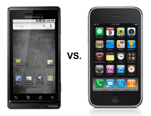 Note to the FTC: I'm not keeping it, dudes — it's a loaner! Of course, I don't need it, anyway, since I'm now into my third year of unmitigated iPhone bliss, having upgraded to a new 3GS a couple months ago. Well, I should say bliss with Apple, not necessarily with AT&T. The latter is, of course, the only carrier choice in the U.S. for the iPhone — unless you want to jail-break your phone and void the warranty. People tell me they do that on T-Mobile and the phone works fine. But for those locked into a Verizon contract, or those convinced they can't live without the better 3G network that Verizon claims it has (you know, the superior coverage they keep beating us over the head with in their ads?), then the Droid would seem to be the closest you're going to get to the iPhone experience on Verizon.
The Experience
So, okay, let's start with that — at least the initial experience. (And no company, hands down, does that better than Apple.) Which of the above phones would you rather have? It all starts with the home screen, I guess. Now, granted — on the Droid, if you touch the arrow on the tab at the bottom and slide up, you get a much better looking screen on with all your little app icons — and without the mottled gray background (what's with that?) — but, overall, I have to say that the visual experience with the Droid doesn't compare well with the iPhone. And I say that even knowing that the screen is supposed to be higher resolution than the iPhone (personally, I didn't notice that much). I guess it's really the "brand experience" I'm talking about here. And that applies to the box, the packaging, too. Motorola (or is it Verizon?) tried to come up with something here as good as the iPhone, but to me they missed the mark. Something about the darkness of the whole thing — the black, the gray, and then that goofy little glowing red ball on the screen (on both the package and all over Verizon's promotional materials). Inside the package, though, the little "Getting Started" booklet is very nicely done — love the fanfold, and it tells you everything you need to know, quickly.
(NOTE: See the "Update" added at the bottom of this post.)
The Feel
The Droid feels good in my hand — solid, a little heavier than the iPhone. But that seems to be because it has more metal. And, heck, it does have a slide-open keyboard, so it should be heavier. But that slight additional weight didn't bother me. It's also a little thicker than the iPhone, as you would expect — but that's hardly even noticeable. It's a teeny bit narrower as well. To be quite honest with you, though, that actually feels a little more natural in my hand than the iPhone does.
A Look at How the Droid Is Billed
So, here's how Verizon presents the new Droid phone on its web site — including a big fat poke at the iPhone in a commercial they run at the front of this web page (hit "Skip Intro" if you've seen it). Funny how every new smart phone out there has to go after the leader. And Motorola, the manufacturer of the Droid with whom Verizon partnered, describes the phone thusly on its media center page for media and bloggers:
Introducing DROID by Motorola, a Smartphone powered by
Android 2.0 developed in partnership with Google and Verizon Wireless,
the nation’s largest 3G network. DROID delivers high-speed Web,
voice-activated search, a super large touch screen and thousands of
customizable apps and widgets from Android Market™. With the
thinnest full QWERTY slider available on the market, it’s a
no-compromise supergenius in your pocket, multitasking at break-neck
pace to get things done.
High-Speed Mobile Browsing
• See the Web at break-neck speed on the largest high-resolution display with a Flash 10 ready HTML browser.
• Look up favorite sites, video and music fast with a high-speed, cortex A8 processor and lightning-fast connection.
•View it all on the 3.7” display with more than 400,000 total pixels, which is twice that of the leading competitor.
• Work faster on the Web with double tap to zoom in and out.
Google Searches Beyond the Web
• Type your search to deliver results such as contacts and music offering a complete search experience on a mobile device.
• Use voice-activated search to serve up both your contacts and Google search results, based on your location.
• Find your way with free spoken turn-by-turn directions with Google MapsTM Navigation (Beta), with Street View and LatitudeTM. View geographic information, such as My Maps, Wikipedia entries and transit lines, right on the map.
How It Worked for Me
I must say the Droid itself, and Verizon's service, worked pretty darn well, in the few hours I spent playing with the phone. The hardware is solid, and the service is fast — whether accessing the web, the "Android Market" to download apps, sending emails and texts… it all was quite speedy. I downloaded about four apps, one at a time, and they were all on my home screen fast. I've never used the Android Market before to get apps (this is the first time I've ever even used an Android phone), and I have to say I was pleasantly surprised to see how well it worked. (I hear about 10,000 apps are available there now, versus 85,000 for the iPhone on the App Store.) I downloaded a few apps from Minneapolis-based DoApp Inc. (which already has 75 in the Android Market) — I grabbed "MyLite," our local "WCCO-TV Mobile Local News," and a similar one for San Diego called "SD 6 News." I also searched the Android Market for the app I use most — "Tweetie" — but no dice. Also couldn't find "Twitterific," another one I've used. But there were tons of Twitter apps in the Market, most of which I'd never heard of, or they were specialized apps for certain kinds of tweet content. The one general Twitter app that looked to be the most highly rated, in the five-star icons that appear with each app, was "Twidroid" — but I didn't take the time to try it (I know how Twitter apps work).
I also tried the camera yesterday, and found it works okay, though it took me a while to figure out how to best use the skinny little camera button on the side. And I really didn't notice the camera's auto-focus function. I did email photos successfully. They must be big files, because it's a 5-megapixel camera.
Built-in apps like YouTube worked great. Again, quick access — and I searched on my name, and up came all my videos very quickly, in a nice interface, and even some I had favorited (all mixed together with my vids). The Maps app was awesome. Very impressive, and the GPS function was pretty darn accurate in instantly finding my location. There's a new "Layers" aspect to the Maps that I didn't really understand, but I clicked on "Traffic" and got a different view. Then I drilled in via the "Satellite" menu option and got a scary-good overhead view of my neighborhood — up close and personal. Maybe that higher-res screen is what made the Maps look so darn good on the Droid.
The slide-open keyboard worked okay for me, but my fingers (which really aren't very big) were fat-fingering that thing bigtime. I honestly would have no idea how anyone could double-thumb that keyboard — except maybe someone with thumbs the size of a three-year old. I much preferred using the "virtual keyboard," which comes up automatically when doing searches, emailing, etc. But the keys are much smaller for that in portrait mode than the iPhone's virtual keyboard — making it horribly hard to use! So, flip it to landscape mode, and you get much bigger keys. That option worked way better for me.
So, What's My Net-Net?
Okay, those are some of good things. I try hard to be a positive guy! But now how do I really feel? 🙂 Let me try to give my overall, bottom-line assessment…
Some things that really bugged me were the lack of the nice big, round home switch which I'm so used to at the bottom front of the iPhone. Man, I really missed that on the Droid! Having to go to the top of the phone, and find that little tiny switch at the upper right was a real pain. I swear it takes two hands, or a real contortion of one hand, to press that damn thing! That is a major user-experience mistake in my book. I also found a lot of other things that just weren't intuitive about the phone's operation, or the navigation within apps, including email and texting. For example, I could not figure out how a text became a Draft when I was trying to send it, nor could I figure out how to retrieve that Draft so I could send it. Couldn't figure out how to delete some private messages I'd sent, either, before I turn in the phone. And, right now, I can't even get back to the home screen, no matter how many times I press the little home icon on the front of the phone. Another weirdity: I have yet to see where I go for "Settings" — there's no icon I can see for that, as there is on my iPhone. So I could not, for example, shut off the damn machine-language guy saying "Dro-o-o-id" in a low, bass drone every time an email came in. Puh-lease. Also, it just never really seemed natural to use this phone — which way to hold it… up or sideways, or slide it open… or what. And that home button way up top, then the camera button way down low.
So, okay, my net-net … you knew this was coming: it ain't no iPhone. Now, if you really can't leave Verizon, and you really want to pay the same price as an iPhone ($199 with a two-year contract), just to stay with Verizon — then, yes, it's a close experience. But close is what you get, not the cigar.
Then again, if you really like Verizon all that much, why not just wait? All us fanboys in the know predict Apple is sure to add Verizon as a carrier for the iPhone here in the U.S., just as soon as the AT&T exclusive expires.
What do you think? Lock yourself in for two more years with Verizon now, or wait for the iPhone? What would you do?
UPDATE 11/6/09:
Wanted to cite an earlier, very comprehensive Droid review by Engadget, which appeared prior to mine. (Amazing how being a paid blogger let’s you go to the lengths this guy did.) Also wanted to give this local shout-out: Garrick Van Buren’s Droid review. Finally, I point you to what I think is the best review of all — by the master himself, Walt Mossberg of the Wall Street Journal, on November 3rd: Motorola’s Droid Is Smart Success for Verizon Users. In addition, here are some more local tie-ins: a growing, grass-roots local organization called Mobile Twin Cities, and their Google Group. They’re focused on all things mobile, including marketing, and all mobile OSes, including both Android and iPhone, of course. And, on top of that, we even have a burgeoning Minnesota Android Developers Google Group as well.





![Reblog this post [with Zemanta]](https://img.zemanta.com/reblog_e.png?x-id=8ce62b21-01cb-4748-94c9-9b2983f65ebd)





Recent Comments